Deliverables
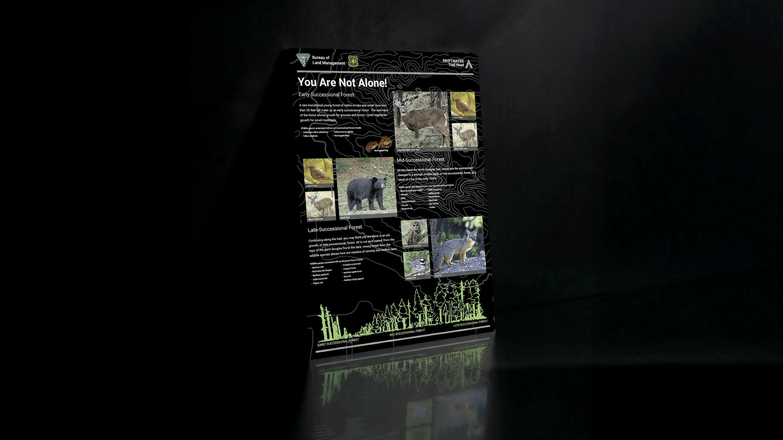
Trailhead information panel (30 × 42)
Layout system + content hierarchy
Brand-aligned typography and graphic styling
Concept design for internal review

Leanna
Designer - Remote (Oregon)
Deliverables
Trailhead information panel (30 × 42)
Layout system + content hierarchy
Brand-aligned typography and graphic styling
Concept design for internal review

Leanna
Designer - Remote (Oregon)
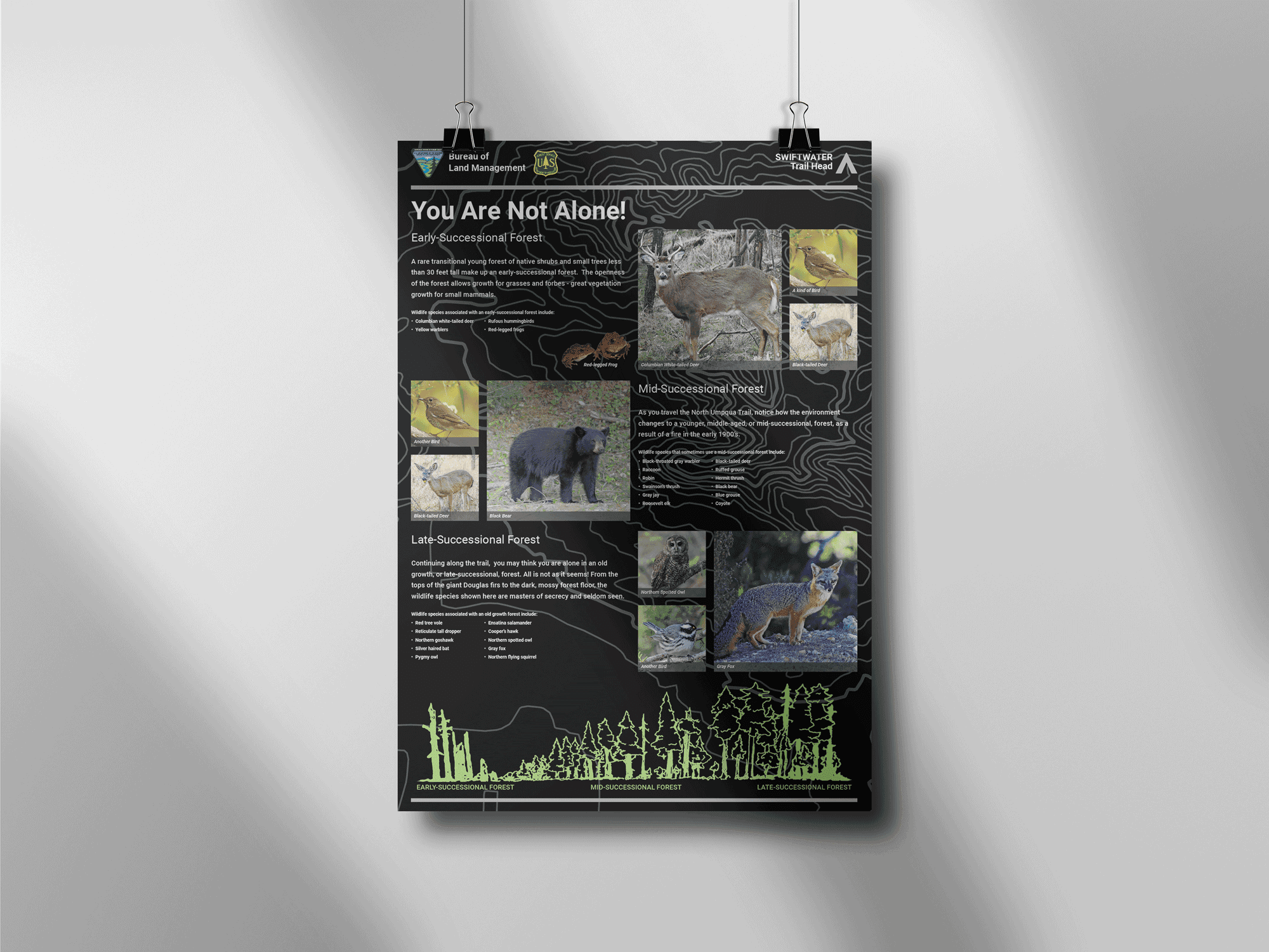
A conceptual redesign of an outdated 30 × 42 trailhead information panel for the Bureau of Land Management. The goal was to modernize the layout and visuals while aligning with updated BLM brand standards—without changing the core educational content.
A conceptual redesign of an outdated 30 × 42 trailhead information panel for the Bureau of Land Management. The goal was to modernize the layout and visuals while aligning with updated BLM brand standards—without changing the core educational content.
Insight
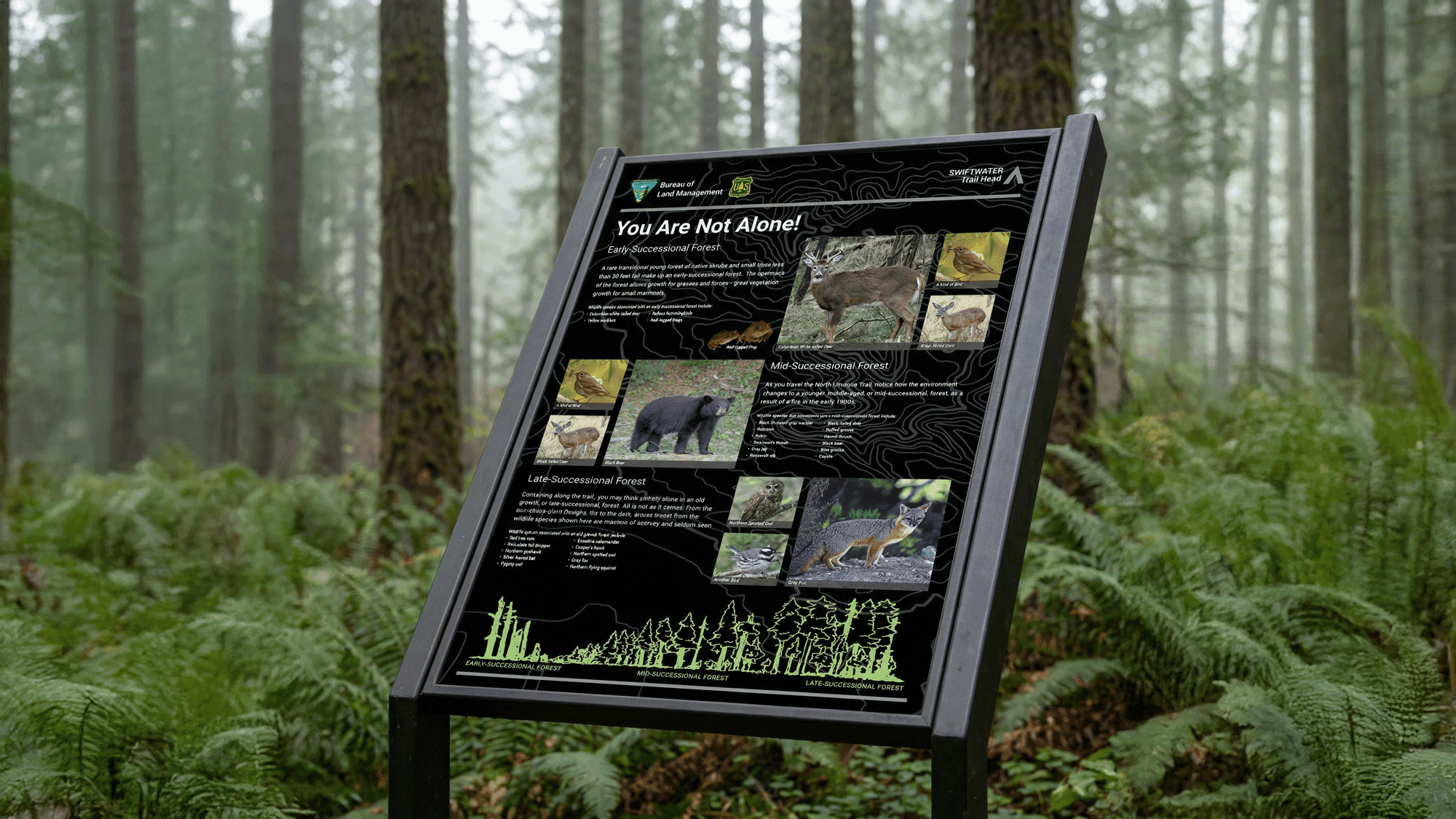
The existing sign contained strong educational content but lacked clarity, visual hierarchy, and brand consistency.
Visitors struggled to scan information quickly, especially in an outdoor environment with varying light and distance.
Insight
The existing sign contained strong educational content but lacked clarity, visual hierarchy, and brand consistency.
Visitors struggled to scan information quickly, especially in an outdoor environment with varying light and distance.

Solution
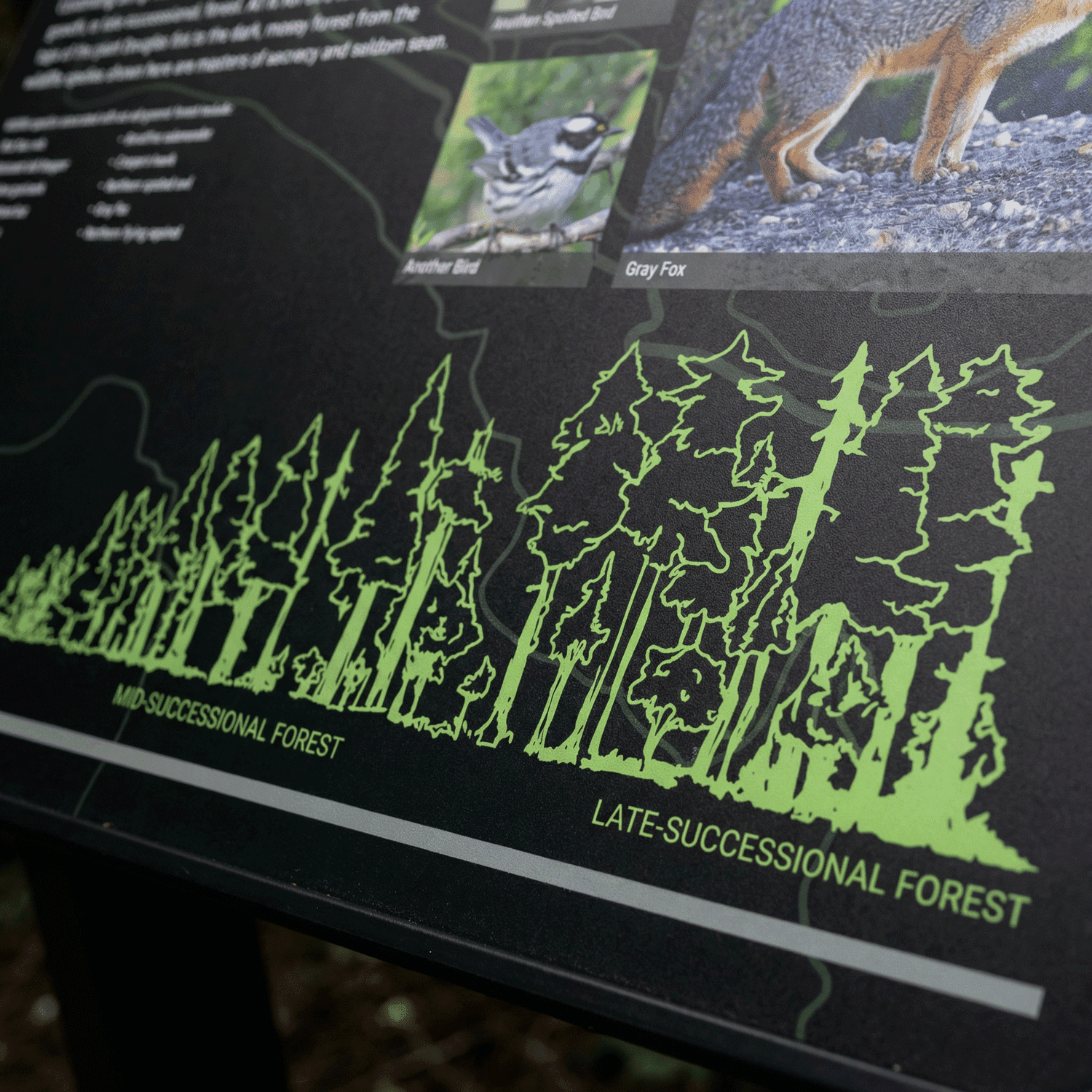
I redesigned the panel with a clear content structure, improved typographic contrast, and a layout that supports quick scanning at a trailhead.
The updated design aligned with current BLM branding while preserving the original educational intent and imagery.
Solution
I redesigned the panel with a clear content structure, improved typographic contrast, and a layout that supports quick scanning at a trailhead.
The updated design aligned with current BLM branding while preserving the original educational intent and imagery.
Impact
Although the project paused due to budget constraints, the concept was well received and used internally to evaluate layout direction. The work also led to a second design request for another trailhead sign, validating the approach and design process.
Latest projects
Web Design
DC Pet Lodge
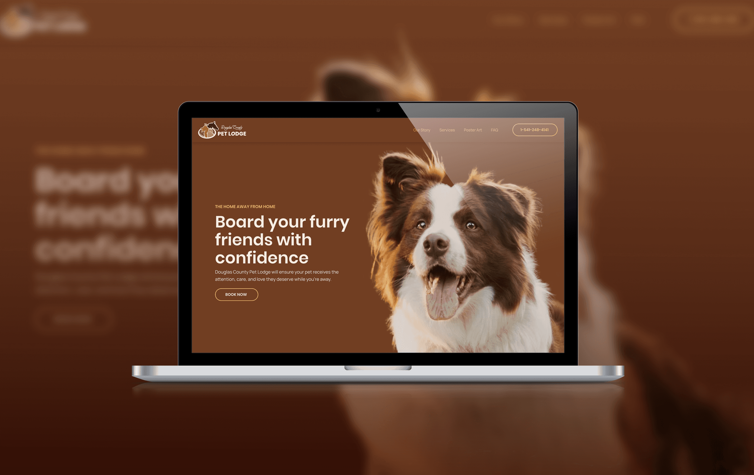
A friendly, CMS-driven website helping a local dog boarding business build trust and visibility online.
Web Design
DC Pet Lodge
A friendly, CMS-driven website helping a local dog boarding business build trust and visibility online.

Graphic Design
DFPA
Custom die-cut sticker collection celebrating wildfire fighters and the work of DFPA

Graphic Design
DFPA
Custom die-cut sticker collection celebrating wildfire fighters and the work of DFPA
